

In this tutorial we're going to learn how we can create cool animated social media popup icons using only css for icons we'll use font awesome icons library
Click here to get starter files
🔗Fontawesome cdn
First let’s insert font awesome cdn inside body or head tag ( we’ll going to use font awesome icon in this project )
js<scriptsrc="https://kit.fontawesome.com/dd8c49730d.js"crossorigin="anonymous"></script>
🔗Let’s create the skeleton of the ui
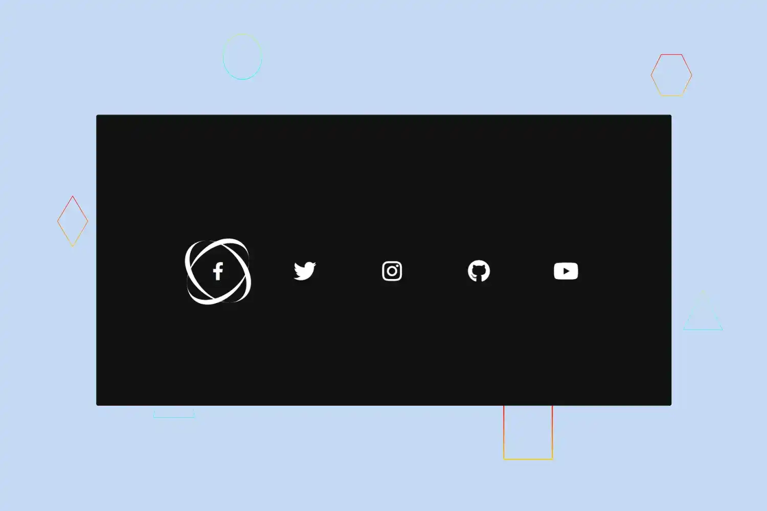
markup of social media icons with the div wrapper
html<div class="wrapper"><div class="icon facebook"><span><i class="fab fa-facebook-f"></i></span></div><div class="icon twitter"><span><i class="fab fa-twitter"></i></span></div><div class="icon instagram"><span><i class="fab fa-instagram"></i></span></div><div class="icon github"><span><i class="fab fa-github"></i></span></div><div class="icon youtube"><span><i class="fab fa-youtube"></i></span></div></div>


🔗Styling the ui
Basic styling
css* {margin: 0;padding: 0;box-sizing: border-box;}body {font-family: "Poppins", sans-serif;background: #111;}
Change color of font awesome icon
css.wrapper .icon i {color: #fff;transition: 0.4s linear;}


Center wrapper
css.wrapper {display: flex;justify-content: center;align-content: center;margin-top: 50vh;}


CSS for styling icon
css.wrapper .icon {position: relative;border-radius: 50%;padding: 15px;margin: 10px;width: 50px;height: 50px;font-size: 18px;display: flex;justify-content: center;align-items: center;flex-direction: column;cursor: pointer;}


🔗Let's create popup effect for icons
css.wrapper .icon::before,.wrapper .icon::after {content: "";position: absolute;box-sizing: border-box;width: 100%;height: 100%;left: 0;top: 0;transition: 0.4s linear;}
In above css code we just defined before and after selector to icon class ( we’ll going to use these selectors to insert border to icons and transform to create cool effect )
Before effect
css.wrapper .icon::before {border-radius: 50%;border-left: 4px solid;border-right: 4px solid;transform: skewX(20deg);color: #fff;}
In above css code we just added border from left and right side to div icon and transformed to skewX 20deg


After effect
css.wrapper .icon::after {border-radius: 50%;border-top: 4px solid;border-bottom: 4px solid;transform: skewY(-20deg);color: #fff;}
In above css code we just added border from top and bottom side to div icon and transformed to skewY -20deg ( Just like we did before here just did vice versa )


But we want this effect on hover so let’s defined this effect on hover ( just updated above css code with :hover selector )
css.wrapper .icon:hover::before {border-radius: 50%;border-left: 4px solid;border-right: 4px solid;transform: skewX(20deg);color: #fff;}.wrapper .icon:hover::after {border-radius: 50%;border-top: 4px solid;border-bottom: 4px solid;transform: skewY(-20deg);color: #fff;}
🔗Let’s create the tooltip effect on hover
Markup of tooltip
(update markup of social media icons with the div wrapper as follows )
html<div class="wrapper"><div class="icon facebook"><div class="tooltip">Facebook</div><span><i class="fab fa-facebook-f"></i></span></div><div class="icon twitter"><div class="tooltip">Twitter</div><span><i class="fab fa-twitter"></i></span></div><div class="icon instagram"><div class="tooltip">Instagram</div><span><i class="fab fa-instagram"></i></span></div><div class="icon github"><div class="tooltip">Github</div><span><i class="fab fa-github"></i></span></div><div class="icon youtube"><div class="tooltip">Youtube</div><span><i class="fab fa-youtube"></i></span></div></div>
CSS for styling tooltip
css.wrapper .tooltip {position: absolute;top: 0;font-size: 14px;color: #ffffff;padding: 5px 8px;border-radius: 5px;box-shadow: 0 10px 10px rgba(0, 0, 0, 0.1);pointer-events: none;transition: all 0.3s cubic-bezier(0.68, -0.55, 0.265, 1.55);}


Define opacity to hide tooltip by default
cssopacity: 0;


Hover on top tooltip
css.wrapper .icon:hover .tooltip {top: -45px;opacity: 1;visibility: visible;pointer-events: auto;}
Transform scale and add transition on span and tooltip on hover
css.wrapper .icon:hover span,.wrapper .icon:hover .tooltip {text-shadow: 0px -1px 0px rgba(0, 0, 0, 0.1);transform: scale(0.8);transition: 0.4s linear;}
Congratulation we have successfully created social media popup icons 🥳

