

In this tutorial we're going to learn how to we can create animated profile card using html and css we'll use font awesome for icons
🔗Get started ✌
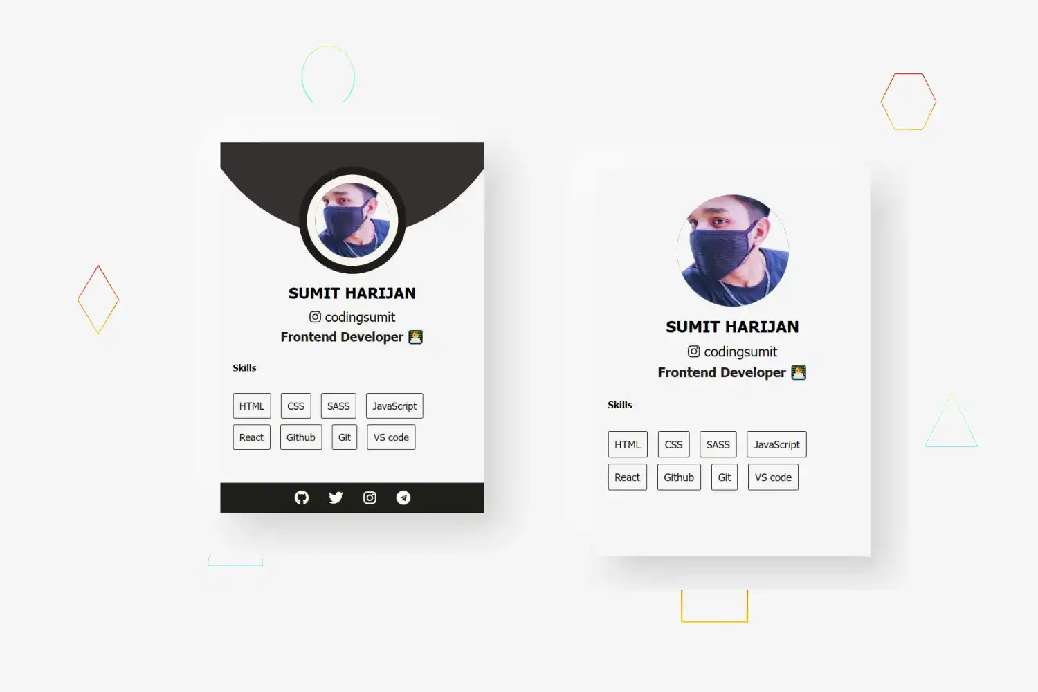
The Profile card we’ll build in this tutorial will be pretty cool. where we have cool profile image , main content with skills section and animated social icons
I’ll explain how to build each section, but you must follow along by typing the code and running it on your end to get the most out of this tutorial
Click here to get starter files
🔗Add font awesome cdn
Before let’s get started add font awesome cdn
We’ll use font awesome icons in this project for that we need to include font awesome cdn inside the head or body tag you can create your own font awesome kit
html<scriptsrc="https://kit.fontawesome.com/dd8c49730d.js"crossorigin="anonymous"></script>
🔗Markup of card and profile
html<div class="card"><div class="profile"><img class="img-fluid" src="profile.png" /></div></div>


🔗Let’s add styling into card and profile
Center card and basic body styling
cssbody {margin: 0;font-family: tahoma;height: 100vh;background: #f5f5f5;display: flex;justify-content: center;align-items: center;}
Styling for card
css.card {padding: 30px 0 55px;margin-bottom: 30px;background-color: #f5f5f5;text-align: center;overflow: hidden;position: relative;box-shadow: 20px 20px 42px #d0d0d0, -20px -20px 42px #ffffff;width: 20rem;}
Basic styling positioning, box-model , visuals for card profile
css.card .profile {display: inline-block;height: 130px;width: 130px;z-index: 1;position: relative;border-radius: 20%;}
Styling for card profile img
css.card .profile img {width: 100%;height: auto;border-radius: 50%;transform: scale(1);transition: all 0.9s ease 0s;}
Transform img on card hover
css.card:hover .profile img {box-shadow: 0 0 0 14px #f7f5ec;transform: scale(0.7);}
Adding fluid effect height :- we given 0 we’ll make height to 100% on card hover
css.card .profile::before {content: "";width: 100%;height: 0;border-radius: 50%;background-color: #1f1b1b;position: absolute;bottom: 135%;right: 0;left: 0;opacity: 0.9;transform: scale(3);transition: all 0.3s linear 0s;}
Show fluid effect on card hover
css.card:hover .profile::before {height: 100%;}
Adding circle border effect on profile
css.card .profile::after {content: "";width: 100%;height: 100%;border-radius: 50%;background-color: #1f1b1b;position: absolute;top: 0;left: 0%;z-index: -1;}
🔗Markup of main content
html<div class="main-content"><h3 class="name">Sumit Harijan</h3><span><i class="fab fa-instagram"></i> codingsumit</span><h4 class="title">Frontend developer 👨💻</h4></div>
🔗Let’s add styling into main content
css.card .main-content {margin-bottom: -19px;}


css.card .main-content .title {display: block;font-size: 15px;color: #1f1b1b;text-transform: capitalize;margin: 5px 37px 0;}


css.card .main-content .name {padding: 0;margin: 8px;text-transform: uppercase;}
🔗Markup of social media
html<ul class="social"><li><a href="#" class="fa fa-github"></a></li><li><a href="#" class="fa fa-twitter"></a></li><li><a href="#" class="fa fa-instagram"></a></li><li><a href="#" class="fa fa-telegram"></a></li></ul>
🔗Let’s add styling into social media
css for social
css.card .social {width: 100%;padding: 0;margin: 0;background-color: #1f1f1b;position: absolute;left: 0;transition: all 0.5s ease 0s;}
Make all social icons in a row
css.card .social li {display: inline-block;}


css for social media anchors tag
css.card .social li a {display: block;padding: 10px;font-size: 17px;color: #fff;transition: all 0.3s ease 0s;text-decoration: none;}
Change color , bgcolor on hover
css.card .social li a:hover {color: #3e3b44;background-color: #f7f5ec;transition: 0.5s;}
But we want transition on socials from bottom on card hover for that we
have to give bottom to -100px and when we hover on card we’ll set bottom to 0
Give bottom to -100px in card social (update css for card social as follows )
css.card .social {width: 100%;padding: 0;margin: 0;background-color: #1f1f1b;position: absolute;bottom: -100px;left: 0;transition: all 0.5s ease 0s;}
On card hover give bottom to 0 to show social
css.card:hover .social {bottom: 0;}
🔗Markup of skills
html<div class="skills"><h6>Skills</h6><ul><li>HTML</li><li>CSS</li><li>SASS</li><li>JavaScript</li><li>React</li><li>Github</li><li>Git</li><li>VS code</li></ul></div>


🔗Let’s add styling into skills
Basic styling for skills ( aligned all text to left , given 15px padding )
css.skills {text-align: left;padding: 15px;}


Remove default list-style-type and give margin , padding to 0 for no space between the inner (content) box and the outer (border) box
css.skills ul {list-style-type: none;margin: 0;padding: 0;}
CSS for skills ui li
css.skills ul li {border: 1px solid #1f1b1b;border-radius: 2px;display: inline-block;font-size: 12px;margin: 0 7px 7px 0;padding: 7px;}


Change color and bgcolor on hover skills items
css.skills ul li:hover {background-color: #1f1b1b;color: #fff;cursor: pointer;transition: 0.5s;}
Congratulation we have successfully created animated profile card 🥳

