

In this tutorial we're going to learn how to create responsive animated sticky navbar with nav link animation using html css and Javascript
Click here to get starter files
🔗First let’s create the skeleton of the navbar
Markup of navbar
html<header><nav class="nav" id="navbar"><div class="logo"><a href="index.html" id="logo"><h1>coding sumit</h1></a></div><ul class="nav__list" id="navlinkitems"><li class="nav__item"><a href="#home-section" class="nav__link" id="home">Home</a></li><li class="nav__item"><a href="#about-section" class="nav__link" id="about">About</a></li><li class="nav__item"><a href="#skills-section" class="nav__link" id="service">Skills</a></li><li class="nav__item"><a href="#projects-section" class="nav__link" id="work">Work</a></li><li class="nav__item"><a href="#contacts-section" class="nav__link" id="contact">Contact</a></li></ul></nav></header>


🔗Let’s add styling into the ui
Basic styling
css/* style.css */html {scroll-behavior: smooth;}* {margin: 0;padding: 0;box-sizing: border-box;}body {margin: 0;font-family: "Source Sans Pro", sans-serif;line-height: 1.6;overflow-x: hidden;background: #fff;}a {text-decoration: none;color: #111;}
CSS for styling navbar, nav list , nav links & logo
css/* style.css */.nav {height: 5rem;width: 100%;display: block;justify-content: flex-start;z-index: 10;font-weight: 300;}.nav__list {list-style: none;display: flex;justify-content: flex-end;margin-top: -49px;padding: 0vh 4vw;}.nav__link {color: inherit;text-decoration: none;margin-right: 50px;position: relative;font-family: "Raleway", sans-serif;padding: 16px 0;margin: 0 12px;letter-spacing: 1px;line-height: 16px;font-weight: 700;transition: color 0.1s, background-color 0.1s, padding 0.2s ease-in;color: #111;}.logo {padding: 3vh 5vw;text-align: center;display: flex;align-items: center;color: rgb(22, 8, 8);text-transform: uppercase;width: 25rem;font-family: "Raleway", sans-serif;font-weight: 800;}


CSS for animating nav link hover underline using ::before
css/* style.css */.nav__link::before {content: "";display: block;position: absolute;bottom: 3px;left: 0;height: 3px;width: 100%;background-color: #000;transform-origin: right top;transform: scale(0, 1);transition: color 0.1s, transform 0.2s ease-out;}.nav__link:hover::before,.nav__link:focus::before {transform-origin: left top;transform: scale(1, 1);}
As you can see above video ☝️ at the end of this step when we hover it’s working as expected
🔗Let’s add some section in a page to enable scrolling for testing sticky navbar
Markup of sections
html<section class="section one" id="home-section"></section><section class="section two" id="about-section"></section><section class="section three" id="skills-section"></section><section class="section four" id="projects-section"></section><section class="section five" id="contacts-section"></section>
CSS For styling sections
csssection {width: 100%;display: flex;margin: auto;align-items: center;min-height: 110vh;}.one {background-color: #fff;}.two {background-color: rgb(190, 183, 170);}.three {background-color: rgb(63, 118, 238);}.four {background-color: rgb(221, 22, 88);}.five {background-color: rgb(163, 114, 8);}
But what about sticky navbar we want to make our navbar sticky on scroll for that we have to
- We have to add position: fixed on .nav css code
css/* Style.css > .nav */position: fixed;
- When we scrolls the page, execute scrollFunction in javascript file
js// index.jswindow.onscroll = function () {scrollFunction();};function scrollFunction() {document.getElementById("navbar").style.background = "#fff";}
As you can see above ☝️ video when we scroll the page navbar stick on the top of the page
🔗Making navbar responsive
Before making navbar responsive we have to create
- Hamburger toggle menu to open and close navbar on mobile devices by clicking toggle button
- Small navbar logo for small devices
Let’s create hamburger toggle menu button
Markup of toggle button and hamburger
html<button class="nav-toggle"><span class="hamburger"></span></button>
Add styling into toggle button
css.nav-toggle {padding: 2.3em;background: transparent;border: 0;cursor: pointer;position: absolute;right: 0.5rem;top: 1.1rem;z-index: 1000;outline: none;}
CSS code for .hamburger menu
css.hamburger {display: block;position: relative;}.hamburger,.hamburger::before,.hamburger::after {background-color: #111;width: 2em;height: 3px;border-radius: 1em;transition: transform 250ms ease-in-out;}.hamburger::before,.hamburger::after {content: "";position: absolute;left: 0;right: 0;}.hamburger::before {top: 6px;}.hamburger::after {bottom: 6px;}


Let’s create .nav-open class ( we’ll toggle this class in navToggle click )
css.nav-open .hamburger {transform: rotate(0.625turn);background-color: #111;}.nav-open .hamburger::before {transform: rotate(90deg) translateX(-6px);background-color: #111;}.nav-open .hamburger::after {opacity: 0;}
Let’s create functionality for toggle .nav-open class on click navToggle
js// index.jsconst navToggle = document.querySelector(".nav-toggle");navToggle.addEventListener("click", () => {document.body.classList.toggle("nav-open");});
In above javascript code we selected the .nav-toggle class using querySelector and added a click event listener to navToggle then toggle .nav-open class to toggle hamburger
As you can see ☝️ above video hamburger menu working as expected but we don’t want that menu in desktop size we want that on mobile devices for that we have to add display:none in .nav-toggle class in style.css ( we’ll display this when we working on responsiveness later in this tutorial but at this moment we don’t want to show this toggle menu button in desktop device )
css/* add display none to ..nav-toggle */display: none;


Let’s create small navbar logo for small devices
Markup of small logo
html<div class="smalllogo"><a href="#welcome-section" class="logolink"><h2><i class="fas fa-code"></i> coding sumit</h2></a></div>
Let’s add styling into small logo
css.smalllogo {padding: 4.7vh 8vw;text-align: center;align-items: center;color: #111;text-transform: uppercase;font-family: "Raleway", sans-serif;font-weight: 800;display: flex;}


As you can see above image ☝️ we have small logo but we don’t want to show this small logo on desktop devices for that we have to add display none to .smalllogo class similar how we did on .nav-toggle ( we’ll display this when we working on responsiveness later in this tutorial )
css/* add display none to .smalllogo */display: none;


Okay so at this point we have a small logo for small devices , hamburger menu button for toggling navbar open and close on small devices
Now let’s work on responsiveness
Create media queries with the condition max-width : 800px
css/* style.css */@media (max-width: 800px) {}
In above css code we just defined media query and passed max-width : 800px as a condition It’s means when the size of the device less than 800px we want to applied specific styling for phone device
Display toggle button and small logo on small device and hide main logo
css.logo {display: none;}.smalllogo {display: flex;}.nav-toggle {display: block;}
Add styling into navbar , nav lists
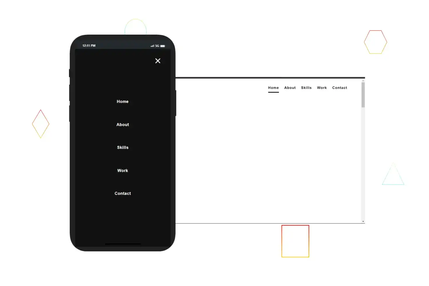
css.nav {display: flex;justify-content: center;position: fixed;top: 0;bottom: 0;left: 0;right: 0;z-index: 100;transform: translateX(100%);transition: transform 400ms cubic-bezier(0.51, 0.6, 0.54, 0.59);height: 100vh;}.nav__list {flex-direction: column;justify-content: space-evenly;text-align: center;margin: 0;padding: 135px;background-color: #111;width: 100%;}.nav__link {margin: 0;color: #fff;}
In above code we added styling into navbar for small device and transformed the whole navbar to translateX(100%)
Transform navbar to translateX(0) on click toggle button
css.nav-open {overflow: hidden;}.nav-open .nav {transform: translateX(0);width: 100vw;}
As you can see above video after clicking we’re able to toggle navbar but we getting one problem The problem is after click on toggle button we not able to see toggle button for closing navbar Reason for this problem is that we defined the black background-color of hamburger in css code
To display toggle hamburger button to close navbar we have to update .hamburger and hamburger::before on .nav-open in media query block
css/* Update .hamburger and hamburger::before on .nav-open as follows in media query block */.nav-open .hamburger {transform: rotate(0.625turn);background-color: #fff;}.nav-open .hamburger::before {transform: rotate(90deg) translateX(-6px);background-color: #fff;}
Add link hover effect
css.nav__link::before {content: "";display: block;position: absolute;bottom: 3px;left: 0;height: 3px;width: 100%;background-color: #fff;transform-origin: right top;transform: scale(0, 1);transition: color 0.1s, transform 0.2s ease-out;}
As you can see above link hover working as expected
Auto close Navbar when click on link (responsive mode)
js// index.jsnavLinks.forEach((link) => {link.addEventListener("click", () => {document.body.classList.remove("nav-open");});});
Congratulation we have successfully created responsive animated sticky navbar 🥳

