

In this tutorial we're going to learn how we can create gocey effect social media icons using only css we'll use font awesome library for icons
Click here to get starter files
🔗Fontawesome cdn
First let’s insert font awesome cdn inside body or head tag ( we’ll going to use font awesome icon in this project )
js<scriptsrc="https://kit.fontawesome.com/dd8c49730d.js"crossorigin="anonymous"></script>
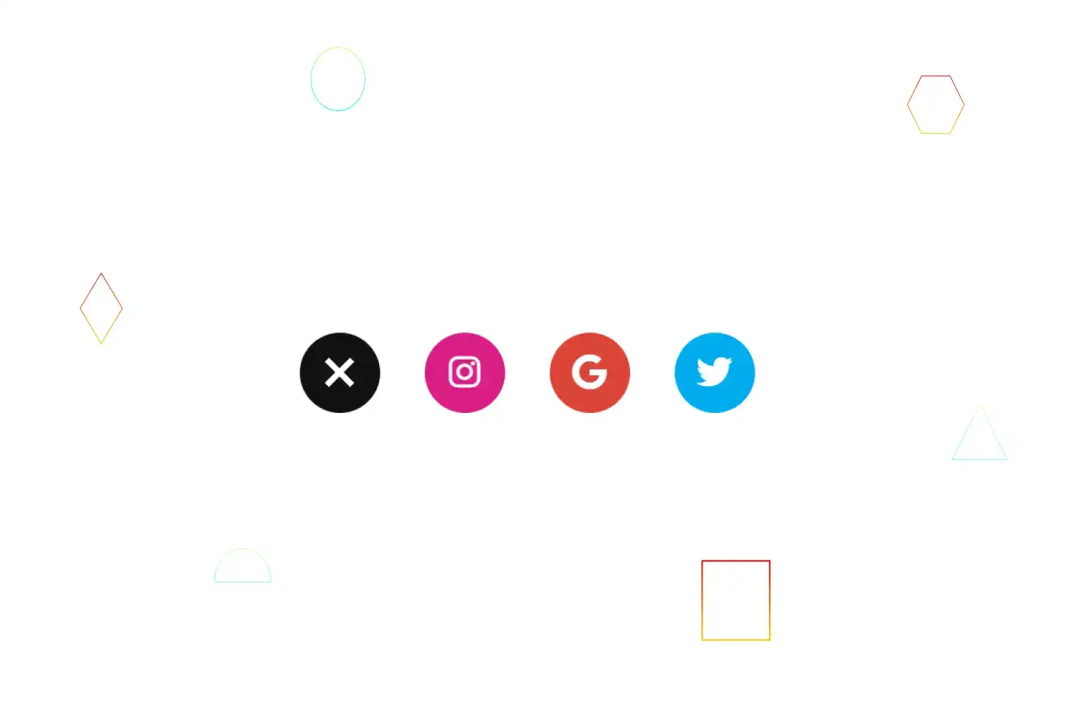
🔗Let’s create the skeleton of the ui
html<div class="wrapper"><div class="menu-object"><ul><li class="ico01 normalico"></li><li class="move-ico ico02"><a href="" class="link link01"><i class="fab fa-instagram"></i></a></li><li class="move-ico ico03"><a href="" class="link link02"><i class="fab fa-google"></i></a></li><li class="move-ico ico04"><a href="" class="link link03"><i class="fab fa-twitter"></i></a></li></a></li></ul></div></div>


🔗Styling ui
Basic styling
csshtml,body {position: relative;width: 100%;height: 100%;margin: 0;overflow: hidden;}
Basic styling for ul and li
cssul {position: relative;margin: 0;padding: 0;list-style: none;display: flex;justify-content: center;flex-direction: revert;}li {width: 54px;height: 54px;border-radius: 50%;cursor: pointer;margin: 8px;}
In above css code we just used display flex to center all ul list and defined width height to list
Styling each icon
css.ico01 {background-color: #111;position: relative;z-index: 4;}.ico02 {background-color: #d91e85;transition: transform 1.2s cubic-bezier(0.77, 0, 0.175, 1);z-index: 3;}.ico03 {background-color: #db4437;transition: transform 1.2s cubic-bezier(0.77, 0, 0.175, 1) 0.4s;z-index: 2;}.ico04 {background-color: #00acee;transition: transform 1.2s cubic-bezier(0.77, 0, 0.175, 1) 0.8s;z-index: 1;}.ico05 {background-color: #3b5998;transition: transform 1.2s cubic-bezier(0.77, 0, 0.175, 1) 0.8s;z-index: 1;}
Center menu object from top
css.menu-object {display: flex;justify-content: center;align-items: center;min-height: 100vh;}


Basic styling to link
css.menu-object .link {display: block;width: 100%;height: 100%;color: #fff;line-height: 1;font-size: 24px;}


Centering font awesome icons
css.menu-object .link i {position: relative;top: 50%;left: 50%;transform: translate3d(-50%, -50%, 0);}


css for creating plus symbol inside first icon
css.menu-object .ico01::before {content: "";position: absolute;top: 0;right: 0;bottom: 0;left: 0;width: 4px;height: 24px;margin: auto;background-color: #fff;transition: transform 0.8s cubic-bezier(0.77, 0, 0.175, 1);}.menu-object .ico01::after {content: "";position: absolute;top: 0;right: 0;bottom: 0;left: 0;width: 24px;height: 4px;margin: auto;background-color: #fff;transition: transform 0.8s cubic-bezier(0.77, 0, 0.175, 1);}
In above css code we just used ::before & ::after selector to create plus For the moment we want to make each icons one over the other
CSS For making each icons one over the other
css.move-ico {position: absolute;top: 0;}


On mousemove or click on first icon we want to transform each icons next to one next after active ( we’ll defined that functionality in javascript later in this tutorial )
First let’s defined transform value to make each icon next to one next on active
css.active .ico02 {transform: translateX(calc(54px + 30px));transition: transform 1.2s cubic-bezier(0.77, 0, 0.175, 1) 0.8s;}.active .ico03 {transform: translateX(calc(54px * 2 + 30px * 2));transition: transform 1.2s cubic-bezier(0.77, 0, 0.175, 1) 0.4s;}.active .ico04 {transform: translateX(calc(54px * 3 + 30px * 3));transition: transform 1.2s cubic-bezier(0.77, 0, 0.175, 1);}
🔗Let’s defined functionality to toggle to active .active class
jsfunction toggle() {let toggleIcon = document.querySelector(".ico01").addEventListener("mouseover", active);function active() {let wrapper = document.querySelector(".wrapper");wrapper.classList.toggle("active");}}toggle();
In above javascript code we just defined toggle function within that function
- We selected first icon using querySelector method and assigned to toggleIcon
- Added mousemove event Listener to toggleIcon and called active function
- Created active function
- Selected wrapper class element using querySelector method
- Toggle active class to wrapper
As you can see above it’s working as expected
Let’s add some more features
🔗Let’s change the plus symbol to cancel symbol of first icon on active
css for changing menu object plus symbol to cross cancel symbol after active
css.active .menu-object .ico01::before {transform: rotate(45deg);}.active .menu-object .ico01::after {transform: rotate(45deg);}
Adding transition on hover icon
css.active .icon:hover {top: -20%;transition: 0.5s cubic-bezier(0.51, 0.5, 0.54, 0.52);}
As you can see above it’s working as expected
Congratulation we have successfully created social media popup icons 🥳

