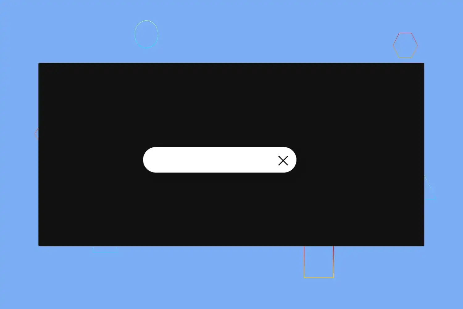
In this tutorial we’re going to learn how we can create amazing animated search bar using only css
Click here to get starter files
🔗First let’s create the skeleton of the ui
Markup of search bar
html<input type="text" class="searchfield" /><div class="search"></div>

In above html code we created one text input type for search bar and one div with the class name search we’ll use that div for creating search icon and cancel icon using css
🔗Let’s add styling into the ui
Basic styling
css* {margin: 0;padding: 0;box-sizing: border-box;}html,body {width: 100%;height: 100%;}
Center everything and basic styling in body
cssbody {display: flex;justify-content: center;align-items: center;min-height: 100vh;background-color: #111;font-family: "Ubuntu", sans-serif;}

Styling input type text .searchfield
css.searchfield {/* positioning */position: absolute;/* typography */font-weight: 600;font-weight: bolder;/* box model */padding: 0 80px 0 20px;margin: auto;top: 0;right: 0;bottom: 0;left: 0;width: 50px;height: 50px;outline: none;border: none;z-index: 5;letter-spacing: 0.1em;/* visuals */background: #fff;color: #111;text-shadow: 0 0 10px #ccc;border-radius: 30px;box-shadow: 12px 13px 25px 0 #111, 8px 9px 25px 0 rgba(0, 0, 0, 0.2);transition: all 1s;}
In above code we written css for styling searchfield see result below 👇

We want to expand width of search field on focus let’s write css for that
css.searchfield:focus {width: 300px;cursor: text;}
Let’s write css for creating search icon
css.search {position: absolute;margin: auto;top: 0;right: 0;bottom: 0;left: 0;width: 50px;height: 50px;background: #fff;border-radius: 50%;transition: all 1s;z-index: 4;}
To see search icon we have to describes opacity 0 to make searchfield transparent in .searchfield
Add following css code in .searchfield class
cssopacity: 0;

Now we can see one small circle
We want search icon inside this circle div let’s write css for that
css.search::before {content: "";position: absolute;margin: auto;top: 10px;right: 8px;bottom: -5px;left: 22px;width: 12px;height: 2px;background-color: #111;transform: rotate(45deg);}
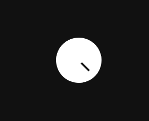
css.search::after {content: "";position: absolute;margin: auto;top: -5px;right: 0;bottom: 0;left: -5px;width: 15px;height: 15px;border-radius: 50%;border: 2px solid #111;}

In above css code we created search icon using ::before and ::after pseudo classes
But there we have one problem when we click to focus on .searchfield to expand width of
.searchfield it’s not expanding
See below
.Searchfield not expanding because in above css code we described the opacity 0 to .searchfield for making searchfield transparent now we have to describe opacity to 1 on focus .searchfield to show and expand search field
Add below css code to .searchfield:focus
cssopacity: 1;
Change cursor pointer on hover .searchfield
css.searchfield:hover {cursor: pointer;}
☝️ As you can see above it’s working as expected at this step everything is rights let’s go to the next step and create cancel icon in right side of search bar
If you remember above we created search icon in .search div now we’re going to use
that same div to create cancel icon too , for this moment let’s give right to -240px
to align search icon in right side of search bar on focus .searchfield
css.searchfield:focus ~ .search {right: -240px;background: transparent;z-index: 6;}
Let’s change the search icon into cancel icon very similarly how we created search icon using css pseudo classes on focus .searchfield
css.searchfield:focus ~ .search::before {top: 28px;left: 15px;width: 25px;height: 2px;bottom: 25px;}
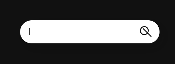
csssearchfield:focus ~ .search::after {top: 29px;left: -8px;width: 25px;right: -15px;height: 2px;border: none;bottom: 25px;background: #111;border-radius: 0%;transform: rotate(-45deg);}
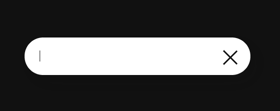
Cursor pointer on hover .search ( on cancel icon )
css.search:hover {cursor: pointer;}
Congratulation we have successfully created animated search bar 🥳
