

In this tutorial we’re going to learn how to create a amazing animated 3d icon using html css
Click here to get starter files
🔗Add font awesome cdn 👇
We’ll use font awesome icons in this project for that we need to include font awesome cdn inside the head or body tag you can create your own font awesome kit
js<scriptsrc="https://kit.fontawesome.com/dd8c49730d.js"crossorigin="anonymous"></script>
🔗let’s create the skeleton of the ui
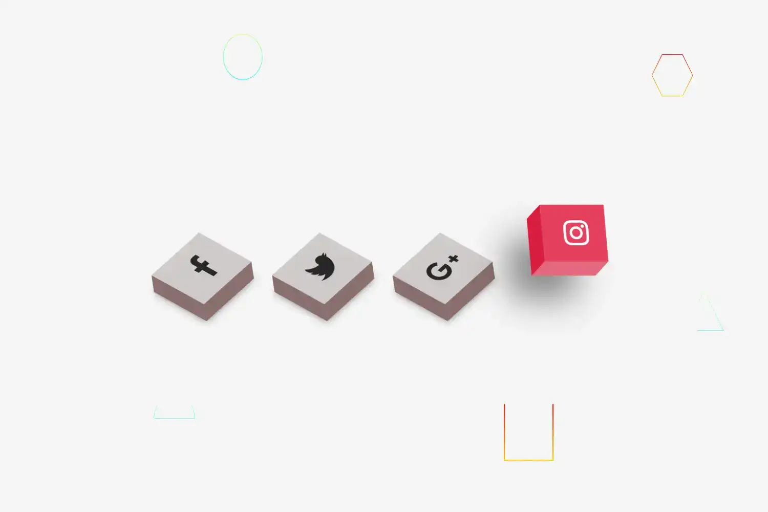
Markup of social media icons
html<ul><li><a href=""><i class="fa fa-facebook"></i></a></li><li><a href=""><i class="fa fa-twitter"></i></a></li><li><a href=""> <i class="fa fa-google-plus"></i></a></li><li><a href=""> <i class="fa fa-instagram"></i></a></li></ul>
In above html code we created four list with the anchor tag within that anchor tag we just inserted html code of font awesome icons


🔗Let’s add styling into the ui
Basic styling & centering everything
cssbody {margin: 0;padding: 0;background: #f5f5f5;position: absolute;top: 50%;left: 50%;transform: translate(-50%, -50%);}


Make all icons in a row
cssul {display: flex;margin: 0;padding: 0;}


Adding margin in all menu icons & removing default list-style-type
cssul li {list-style-type: none;margin: 0 40px;}
Set font size, color, padding, transition on icons ( transition for hover )
cssul li a .fa {font-size: 40px;color: #262626;line-height: 80px;padding-right: 14px;}


Let’s add 3d effect on icons
cssul li a {display: block;width: 70px;height: 80px;background: #cecaca;text-align: center;padding-left: 20px;transform: rotate(318deg) skew(199deg) translate(0, 0);transition: 0.5s;box-shadow: -20px 20px 10px rgba(0, 0, 0, 0.5);}


cssul li a:before {content: "";position: absolute;top: 10px;left: -20px;height: 100%;width: 20px;background: #8a6f6f;transform: 0.5s;transform: rotate(0deg) skewY(-45deg);}


cssul li a:after {content: "";position: absolute;bottom: -20px;left: -10px;height: 20px;width: 100%;background: #8a6f6f;transform: 0.5s;transform: rotate(0deg) skewX(-45deg);}


Add hover effect on icons and change icon color on hover
cssul li a:hover {transform: skew(5deg) translate(20px, -50px);box-shadow: -50px 50px 50px rgba(0, 0, 0, 0.5);}ul li:hover .fa {color: #fff;}
Let’s add some more styling to look more good
Change background color on hover of each 3d icons
cssul li:hover:nth-child(1) a {background: #3b5998;}ul li:hover:nth-child(1) a:before {background: #365492;}ul li:hover:nth-child(1) a:after {background: #4a69ad;}ul li:hover:nth-child(2) a {background: #00aced;}ul li:hover:nth-child(2) a:before {background: #097aa5;}ul li:hover:nth-child(2) a:after {background: #53b9e0;}ul li:hover:nth-child(3) a {background: #dd4b39;}ul li:hover:nth-child(3) a:before {background: #b33a2b;}ul li:hover:nth-child(3) a:after {background: #e66a5a;}ul li:hover:nth-child(4) a {background: #e4405f;}ul li:hover:nth-child(4) a:before {background: #d81c3f;}ul li:hover:nth-child(4) a:after {background: #e46880;}
In above css code we changed the background color of each icons on hover by using nth child selector
Congratulation we have successfully created animated 3d icon 🥳

